
10 Years of Bleep Design
Bleep interviews the designer of the Bleep:10 identity and Bleep Green Series, Stuart Hammersley.
Bleep: You’ve said before that you became interested in graphic design through looking at record covers. Can you tell us about some that made a particularly strong impression?
Stuart Hammersley: Well, some of the very first sleeves would have been for 2-Tone records – those amazing black and white 7" sleeves by John Sims and Jerry Dammers. And there was also a compilation album called Dance Craze too – with all the 2-Tone band logos on – Madness, Specials, The Selecter, Bodysnatchers – I used to practice drawing them. Ian Dury’s ‘Hit Me With Your Rhythm Stick’ was the first record I think I bought with my own money – that had a fantastic cover design by Barney Bubbles on it, who i discovered properly when I was older.
Later on it would be the StreetSounds Electro series… amazing, bold typographic covers.
And then I got into buying hip hop albums… and US imports. Things like Mantronix: The Album; Just Ice: Back To The Old School; EPMD: Strictly Business. PE: Yo Bum Rush The Show, Run DMC: King Of Rock. The cover of the Stereo MC's first album '33, 45, 78' as well – an early Trevor Jackson sleeve. Great typography and graphics – metallic inks, inside of the sleeve printed on and stuff like that. Then by the time I was doing A-levels then i-D magazine was a pretty big influence – around '88–90 – I think Steven Male was art directing it then? But around that time i-D was amazing…
Would you say your personal taste in music has influenced your design work? Did you decide to work with companies like Tempa and Rinse because you felt strongly about the music they promote?
I think now that personal taste maybe plays a part more, certainly in some of the self initiated projects that we've been involved with.
But the work for Tempa came about because Neil Jolliffe – who started the label with Sarah Lockhart – was a friend, and it just so happened that the first Tempa releases he played me I loved… thought it was amazing. I was lucky in that I found the whole scene around FWD>> at that time, and met a lot of the people making that scene and music happen. It was like Acid House the second time around for me… that sense of excitement, openness and acceptance around the clubs and music. So in that sense I felt strongly about it, and that it deserved some care and thought going in to how it was presented visually.
It's kind of true for a lot of the other work that GUA takes on anyway - if you have a connection with it, an interest in the client's business or the project , then that comes through in the quality of the work.
 Skreamism Vol. 7, Tempa
How do you approach creating a visual identity for a label or brand? Have you ever felt particularly challenged by any constraints this might bring?
No, I love constraints! Of course they can be challenging, but from that it can help steer you into a different approach and way of thinking, or take you away from a usual method of working to produce something newer, better etc. That’s one of the reasons we enjoy collaborating with other people as well.
But with an identity you should always be thinking about the intended audience - and is what your doing going to be effective and appeal to them.
You’ve worked with a lot of artists and labels that have been very important to UK club music over the last decade, from the early days of dubstep up until the present. Do you think of what you do as being particularly ‘British’? You’ve mentioned Factory Records and Stiff Records before as influences…
Well for our design work, not especially British, no… maybe more European? I’m not really sure.
There’s a difference in the aesthetic to maybe more American design styles… but it’s not something I’ve given a lot of thought to. The Factory and Stiff reference is that they were both great labels releasing great music; but where the value of design in promoting the music and the ethos of the labels was recognised and appreciated.
One of your early projects pre-Give Up Art involved working with Storm Thorgeson of Hipgnosis on Pink Floyd’s album The Division Bell. What was that like?
Storm was a great character, quite forthright, but great fun. I was just the art working assistant really. Hand-drawing up artboards, and sticking down bromides with a hot wax gun (even though there were Macs around!), taking prints to be retouched by an airbrush artist on Poland street.
I also worked on repackaging all of the Floyd back catalogue then as well, and I got to see the archives of all the old artwotk – original artwork boards for Dark Side of the Moon, outtake contact sheets from the ‘Animals’ and ‘Wish You Were’ here shoots… That was fantastic, and I’m very grateful I came into contact with Storm.
How did Give Up Art come into being and what were your initial ideas behind the company?
It got to the point, at the end of 2006, that I'd had enough of the full time job and thought that I had enough freelance clients to give setting up our own studio try. So discussed it with emma, my wife, and partner in GUA, and we went for it. No real idea beyond us wanting to be more in control of our time – as we had 2 young kids at the time – and also the type of creative work that we took on.
How did you first become involved with Bleep?
It was with the N/S/E/W project – Shaun had had a couple of emails with Dan and Raj at Bleep to discuss the possibility of sealing some prints on the Bleep store – and we all got together for a meeting to discuss some ideas – which turned into the idea for N/S/E/W.
 N/S/E/W
How did you and Shaun Bloodworth meet and why did you decide to work together?
I was art directing a couple of magazines at the time – one was a food and restaurant mag – and Shaun came in one day to show his portfolio. He had some great work in there… so I started to commission him for jobs – portraits and travel features. Shaun was good at seeing the potential from sometimes not such obviously interesting situations, and would always deliver great shots… plus he was good fun to work with. So we became mates; and it seemed natural that when the opportunity came about to work on some music jobs that I gave him a call.
Can you tell us about the N/S/E/W project for Bleep and how that developed?
In 2009 Shaun heard a radio documentary called ‘LA Rocks’, made by Mary Anne Hobbs, about LA’s burgeoning ‘beat’ scene, Low End Theory and it’s associated DJs, MCs and producers. It sounded really exciting over there, and it mirrored what we’d both seen around FWD>> and the early dubstep scene. Shaun suggested we take a trip over there to document it for a personal project; and armed with some email addresses and numbers that Mary Anne had given us. We went to LA for about nine days. We were really lucky – nearly all the big names were there and they gave us so much help and cooperation, and we ended up with a unique document of what was happening around Low End Theory.
After we got back to the UK, the guys at Bleep saw these pictures and we’d discussed producing some posters to sell via the site. So we went to meet with them, and through a few conversations the initial idea expanded from a set of posters to creating a product that would combine a visual and musical element, showcasing some of the most interesting electronic music from various four cities around the world. With GUA working on design and art direction, Shaun on the portraits, and Dan and Raj at Bleep co-ordinated the music – as I remember we all had a hand in drawing up a long list of artists we’d like to have included.
We already had our London/South of England shots and the LA series… so we needed to get out to New York and up to Glasgow to complete it.
Credit Shaun for the original idea to take a chance and head off to LA to start with, when we really had no clear idea of what we’d end up with, and also to Bleep for running with that idea and helping to make it such a success.
Did you approach working on the different regions the project covered in different ways?
Not really – the only difference was that by the time we came to shoot the New York and Glasgow sections of the project we knew who we were shooting, and what it was for. But it was still the same idea – to turn up and to shoot the artists somewhere in their hometown / location that looked interesting… no pre-planned locations. It's more spontaneous and interesting like that – and we got some amazing shots that way – Mike Slott in NY next to the wall of Madonna heads, or Hud Mo surrounded by hundreds of empty coffee cups springs to mind.
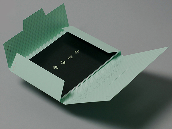
What ideas did you have in mind when creating the visual identity of the Green Series with Bleep?
Well we all sat down together and talked about ideas – me, Shaun, Dan and Raj. We wanted it to feel like a really visually cohesive series – and within that find a way to differentiate between each release, which I did by showing a section of the portrait through the custom die-cut in the sleeve. The photography and the music was the real star of the release – so we didn’t want a lot of unnecessary graphic design getting in the way of that, so we just kept that to a minimum. And the hand-finishing of each sleeve was a way to work within the budget, while at the same time add something a bit special to the releases.
The aesthetics of the N/S/E/W and the Green Series seem to be darker and more austere in tone than the brighter and more playful look of your design work for Tempa and Rinse, for example. How did working on the Bleep label compare to working on those other labels?
Well, slightly different audiences demand different responses I suppose. Some of the Rinse work is definitely bright, but then a lot of the Tempa work is restrained, with more muted colours. With Bleep I think there was a feeling, picked up from working with Dan and Raj, to create work that feels a little bit more restrained aesthetically.
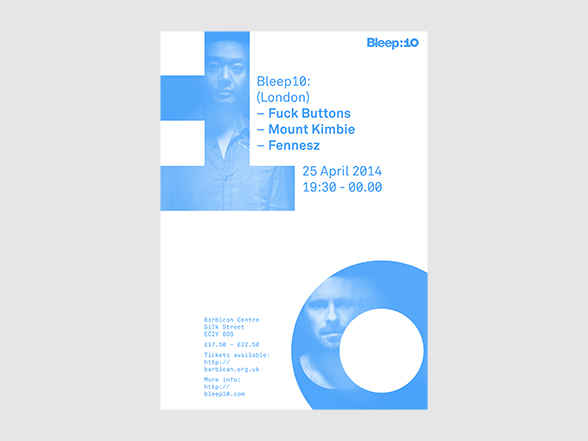
How does the visual identity of Bleep:10 fit in with work you have done previously with the label, as well as the existing Bleep visual identity?
Bleep:10 was great because it wasn’t just a specific physical release, but more an overall identity (that also admittedly included a release!) for use online, at events and on merch.; as well as for Bleep to be able to use in-house on various design collateral. It fits in with the current Bleep identity, in that we used the Bleep master logo and the current brand fonts. We pushed the colour palette a bit though, working in a blue to go with the Bleep green. Which looks great I think. The identity still needed to say ‘Bleep’ straightaway of course, but with the use of the blue it gave the specific ’Bleep:10’ events their own look too.
 Bleep:10 London Poster
The elements of the Bleep:10 identity are based on a 3×4 grid. What is the thinking behind this graphical language?
That came about through one of our first ideas, which was using ones and zeros and binary code – what with Bleep being a digital store – and also the fact that I wanted to make an actual ’10’ icon that looked interesting in it’s own right… So I started messing around with simple bitmap characters. I loved how the very simple ‘1’ looked next to the perfectly circular ‘0’. So once the ‘1’ was drawn up (on a 3×4 grid) I started to develop some more characters on that strict grid – to use on the A, B, C and D sides on the vinyl and then as elements throughout the packaging.
Who are your design heroes?
No heroes… but admiration for, and inspiration from (in no particular order): Saul Bass / Milton Glaser & Push Pin Studios / Total Design / Otl Aicher / Jacqueline Casey / Lance Wyman / Fletcher, Forbes and Gill / Barney Bubbles… And would squeeze Keith Haring, Bridget Riley and Sol LeWitt in there too.
Helvetica. Discuss.
Take good care on the kerning; stay away from the lighter weights, and it'll all be OK.
Designed by Give Up Art
-
Non disponibile
 Non disponibile
- Artist
- Skream
- ReleaseProduct
- Outside The Box - Japan Edition
- Label
- Tempa
- Catalogue Number
- HYDRA008
- Release Date
- 21 luglio 2011
-
 6 brani
- Artist
- Skream
- ReleaseProduct
- Skreamizm Vol. 7
- Label
- Tempa
- Catalogue Number
- TEMPA072D
- Release Date
- 21 dicembre 2012
- Download
-
 20 brani
- Artist
- Various Artists
- ReleaseProduct
- Tempa Presents: UK Dubstep, Vol. 1
- Label
- Tempa
- Catalogue Number
- TEMPABD002
- Release Date
- 6 maggio 2013
- Download
-
 11 brani
- Artist
- Roska
- ReleaseProduct
- Rinse Presents Roska
- Label
- Rinse
- Catalogue Number
- RINSECD016
- Release Date
- 5 aprile 2010
- Download
-
 14 brani
- Artist
- Various Artists
- ReleaseProduct
- Bleep:10
- Label
- Bleep
- Catalogue Number
- BLP10D001
- Release Date
- 5 maggio 2014
- LP
- CD
- Download