
- Matt Pyke
- Stuart Hammersley
- Ed Boaden
10 Years of Bleep Design
Bleep interviews its own designer, Ed Boaden, to hear the thinking behind the recent Bleep.com re-design.
Bleep: How did you come to work as an interface designer? Were there other areas of design that you worked in previous to this?
Ed Boaden: I studied industrial design and worked in that area for a few years before transitioning over to digital design about four years ago. The approach for designing usable physical products isn't really very different from digital; it's all about stripping back unnecessary elements and providing cues for interaction. Usability and the psychology of how people interact with products were always what interested me most about design, and these things are relevant in both disciplines.
I believe that it is very important to have an understanding of how a product is built; either by knowing the manufacturing processes or by being able to code. Understanding front end development is crucial for any digital designer.
How did you become involved with Bleep and what were your reasons for wanting to be involved?
I've been a huge fan of Warp's musical output for a long time and knew how seriously they took design and digital innovation. When I heard about the role at Bleep, I instantly knew it was my dream job.
The development team at Bleep is small, which means the build process and very agile. It also means that everyone has an input into the development of the brand, which is extremely rewarding.
Was online retail something you had been involved in before?
Bleep was my first foray into the retail world. To be working with a product that is so public facing, means we get feedback from customer use very quickly. This means that we can get new ideas for features into the real world without smoothing all the rough edges and gather data and opinions from actual users a lot faster.
Bleep is now ten years old. How do you think the way online stores fit into the landscape of the internet has changed in the last decade?
I think the design patterns (user workflow and interface layout) used in the checkout process and the presentation of products have become much more consolidated over the last ten years. By following these patterns there's a lot less room for innovation, but the tradeoff is that you know users are going to understand how something works if they are familiar with the process from elsewhere on the web.
Customers’ expectations are a lot higher now. People are more comfortable buying online, but expect to do so with a lot less friction than they might have put up with before. Making sure the all processes are streamlined is critical.
What are the aims of the new site?
The aim with the recent redesign of Bleep was to make the store more usable, to provide a consistent and usable experience across mobile and desktop (responsive design), and to lay the foundations for future developments. It was important to maintain the core Bleep identity and values, whilst transitioning people to a more modern feeling site.
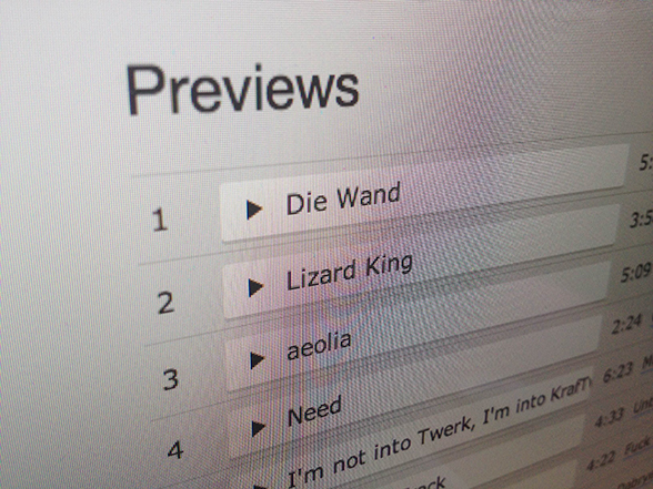 Screen shot of a playlist on Bleep.
Were there any particular problems with the site that you were looking to solve from the outset?
Creating an architecture for the content on the site was the first thing I wanted to address. Before, different areas of the site felt quite isolated. I wanted to create a hierarchy of information and interconnect related areas of the site. Reworking the navigation and bringing it centre stage was the starting point for this. Introducing genres to product pages and showing other releases from the same artist and label were key to making the product pages feel like they were part of a bigger catalogue.
Were there other designers or websites you looked to for inspiration when making changes to Bleep?
The Designer's Republic was an obvious reference. It's been an honour working in the legacy of Matt Pyke's original design and Warp's back catalogue. Other influences included Wim Crouwel, Factory Records: 8vo and Peter Saville, Give Up Art’s work for Rinse and Remote Location’s for Numbers, as well as Internet culture, video games, and illustration. It helps that Bleep is positioned at the intersection of all the industries that I naturally take influence from.
What do you think you learnt from looking at previous incarnations of the Bleep site?
The previous versions now look a little dated, but remain utterly unique. The use of mid-greys and fluorescent highlights are a pillar of turn-of-the-millenium design; echoing tDR's work in the decade before and are a credit to the Bleep brand.
Can you talk us through the process you underwent in designing to current version of Bleep?
I spent a fair while gathering examples of graphic design and web and interface design that I felt said something similar to what I wanted to communicate with Bleep. I also researched store interfaces and the design patterns and workflows used across the web.
I then spent time wire-framing ideas on paper. This means drawing the layout of pages and key elements without getting bogged down with typography, colour or finer details until later in the process.
 Sketch work showing the development of the grid.
I created a flexible grid system that would work across mobile and desktop, and started with that as the base for building the layout in HTML and CSS.
I mocked up elements and layouts in Photoshop to compare ideas and show the team in the early stages of the process, but increasingly I design in the browser: tweaking layout, typography and colour via the code and taking screenshots for reference.
To optimise certain elements of the site, we A/B tested various small changes to see which were most effective in providing a usable experience.
Did the process produce any memorable surprises or challenges?
The grid went through a few iterations on its way to its final form; the flexible layout meant that there were a huge range of possible site layouts to consider and in practice some variations weren't working, so the framework got reconsidered.
I was initially keen to keep the grey background and use white text to accentuate the previous incarnations of Bleep – some customers will have seen this version being tested in production. In the end we felt that the dark web site was somewhat oppressive and so we ended up with the lighter version you are seeing today.
What's next for Bleep from a design perspective?
So far it's been a matter of simplifying and consolidating the Bleep brand and site design. This was about creating a consistent framework and clean user interface. Next is to explore the Bleep identity and push what we've got already to create a unique brand that represents the experience of being part of our vibrant music community.
Your design heroes?
My design heroes – Dieter Rams and Naoto Fukasawa – are taken from the product design world as they provided huge inspiration during my early career and much of what they taught me is applicable to digital design as much as physical. They taught me the importance of simplicity and honesty in design, of affordances of colour and materials, and of storytelling through design.
 Braun shaver by Dieter Rams.
Helvetica. Discuss.
Helvetica is vanilla. It may get stick for being seen as the default choice, but done well, it’s the best flavour!
10 Years of Bleep Design
More from our series of interviews on the design of Bleep.com and Bleep:10.